Plants’ care website
Project, completed in English, as part of the Google UX Design certification as an UX-UI Designer. The goal was to design a responsive website for houseplants' care (enabling users to diagnose and have an action plan to care for them). Since it was a project with no existing framework, I also had to consider the branding and personality of this responsive website.
Project description
I started this project with the user research and empathy stage. During this step, I was able to learn more about the users, especially through analyzing reviews on competitors websites. This helped me identify the pain points, create personas, and map out user journeys to better understand them.
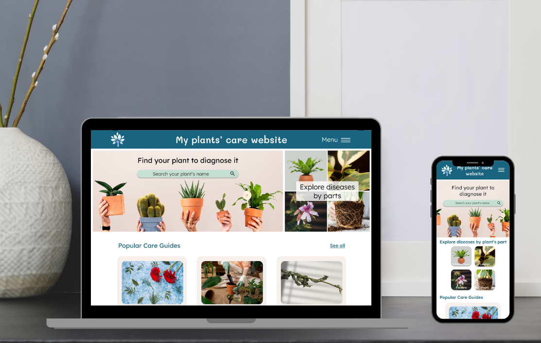
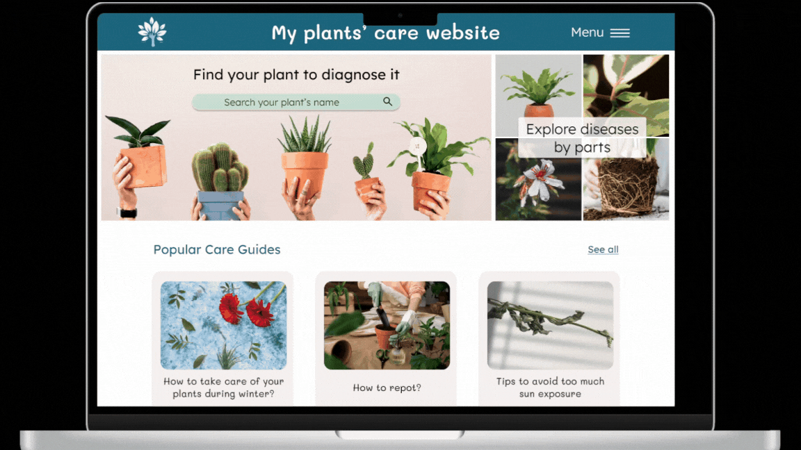
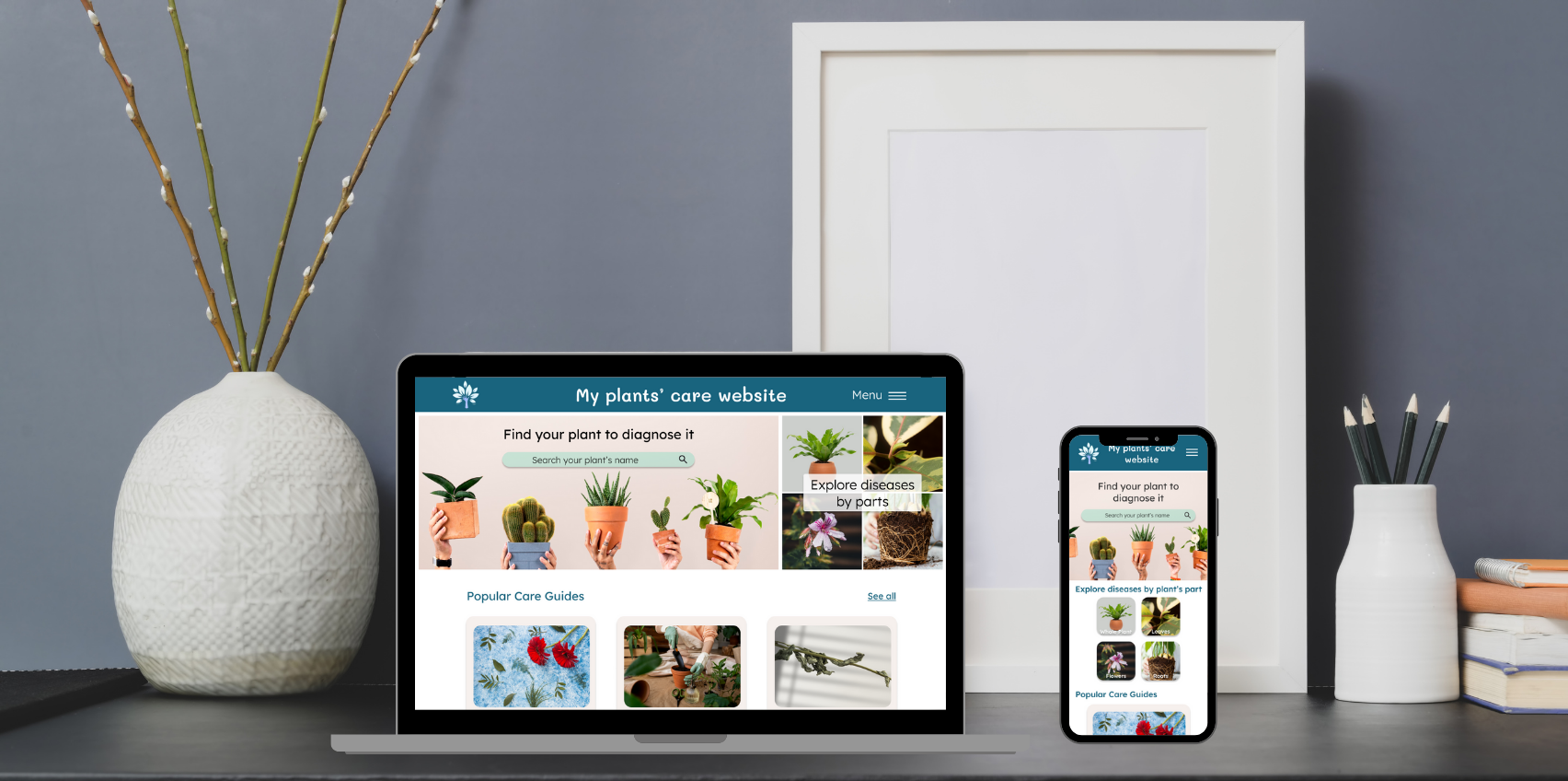
The main goal was to provide users with a simple and quick way to diagnose their plants and receive a personalized treatment plan based on the established diagnosis.


Next, I began the ideation and design stage. I started by creating different versions of wireframes on paper to freely explore my ideas, aiming to have as many design options as possible.
I then reviewed these wireframes, selecting elements that I felt best met the users' needs. This allowed me to design a first low-fidelity wireframe, which I created using Figma.
I then added interactions to create a first low-fidelity prototype with the aim of conducting a usability study early in the design process. This was to allow me to review the site structure, if needed, before incorporating the graphic elements.
For each wireframe created, I also designed the mobile version so that the site could be fully responsive.
Next, I conducted a usability study with 5 people to identify any pain points in the website structure and potential improvements.
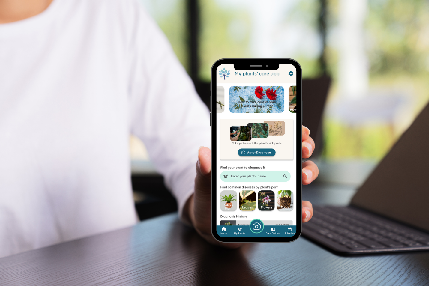
Several points appeared, such as the fact that the auto-diagnose feature (by taking a photo of the plant directly) was not relevant on a web version. Additionally, it was difficult to find one's plant among the long list provided.
After analyzing the tests conducted, I iterated on my previous designs to take all the feedback into account. I then refined my low-fidelity wireframes.
Then, I created the high-fidelity versions (web and mobile), with careful consideration given to the website's branding (color palette, font and color accessibility, tone of text, etc.).
I then designed the high-fidelity prototypes, taking into account the pain points on interactions that emerged during the usability study.

Project overview


Project insights
I was able to design an intuitive, responsive website that meets users' expectations, thanks to their feedback.
A key takeaway from this project is the importance of fully understanding the users, considering their feedback, and their perspective (which may differ from our own).
I also realized that a simple navigation button can make a big difference (with both a positive and negative impact).
Discover another project?